Introduction

MY ROLES:
UX/UI Designer | Information Architect | Visual Designer

DELIVERABLES:

TOOLS:
Figma
Client Overview:
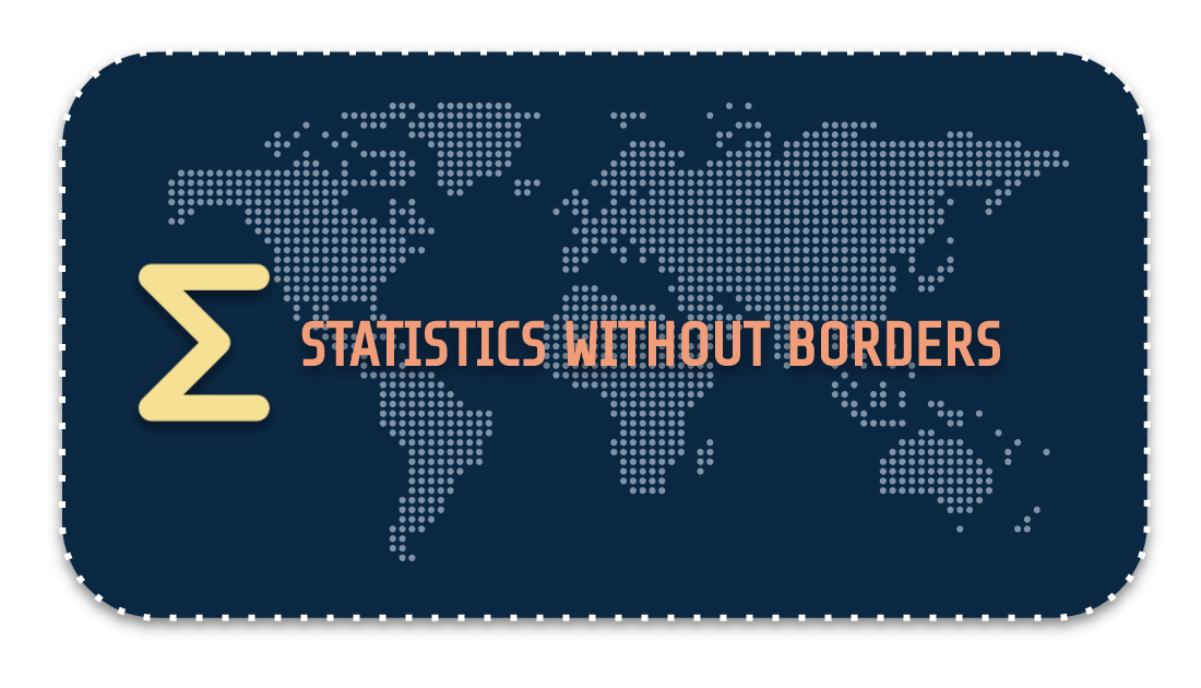
Statistics Without Borders (SWB) is a volunteer outreach group of the American Statistical Association that provides pro bono services in statistics and data science globally. The nonprofit works to improve decision making and knowledge in efforts that promote welfare through the proper application of statistical principles and best practices, where access to such resources is limited. Established in 2008 by Steve Pierson, Gary Shapiro, Fritz Scheuren and Jim Cochran, the organization consists of 1400+ volunteers from 60 countries around the world.
Time Constraint:
2 weeks
Design Process
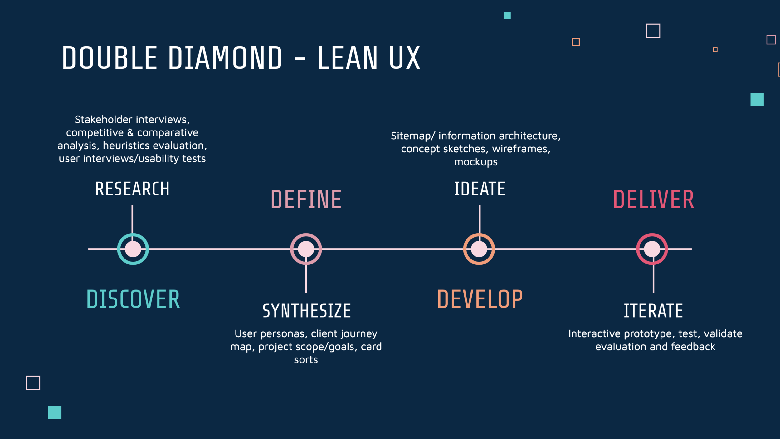
Discover
During our research and discover phase in the design process, we scheduled four meetings with stakeholders to gain perspectives from most executive board members of the organization. From our interviews with these various stakeholders, we highlighted the main concerns of the organization.
Client Priorities:
Raise Awareness About SWB: Establish SWB as a reputable non-profit and highlight pro bono services
Attract New Members, Clients & Volunteers: Optimize website & contact/application forms to increase engagement
Updates About Latest Projects & News: Provide efficient and relevant information about organization and projects
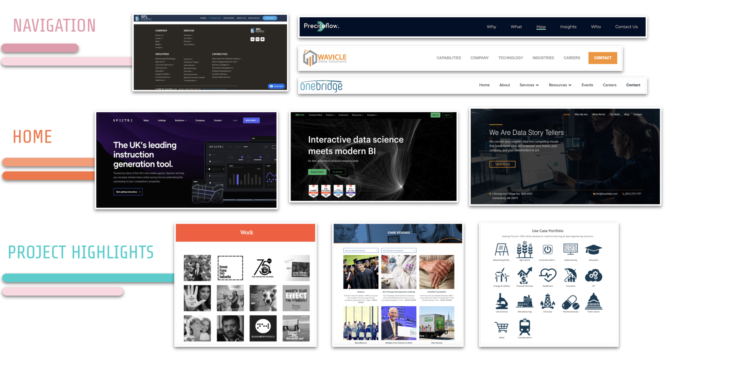
Competitive UI Analysis:
Determining direct and indirect competitors to compare UI features
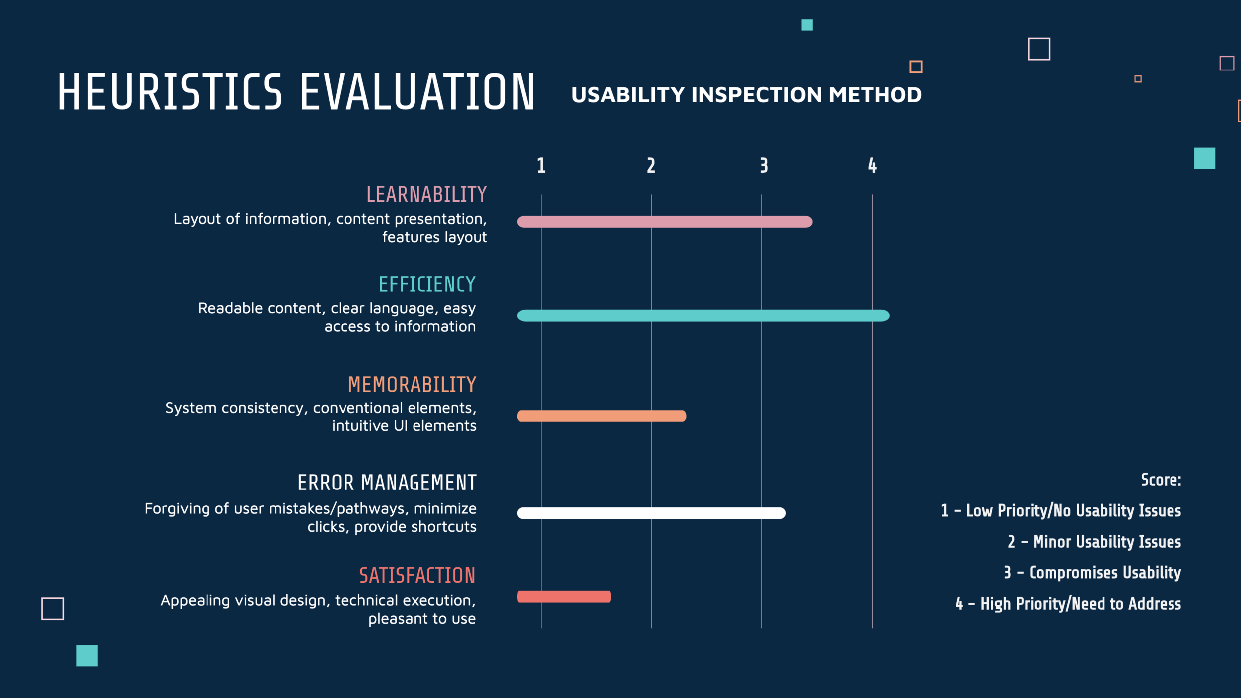
Heuristics Evaluation
We used this usability inspection method to help our team identify usability problems in the user interface design of the current SWB website.
Current SWB Homepage, Projects, & Volunteer Page:
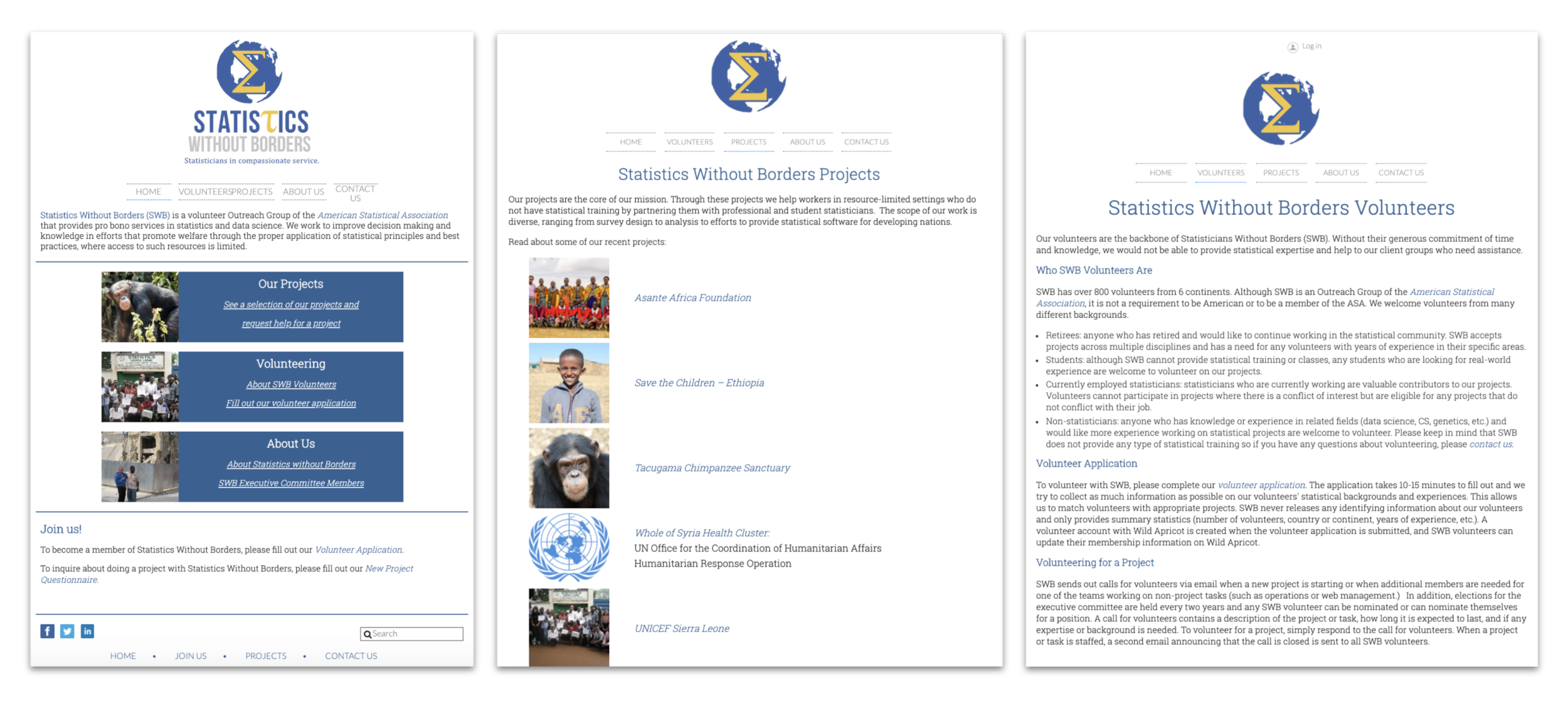
Assessing the usability issues of the current website
We evaluated 5 categories (Learnability, Efficiency, Memorability, Error Management, & Satisfaction) and scored them according to priority.
Learnability, which essentially determines how easily users can understand and process the information, was one of our main priorities. The current website seemed a little text heavy and lacked visual elements to help users grasp the information. As you can see on the current website, the volunteer page may be trickier to process, since it contains blocks of text with essential information.
Another priority was to improve the efficiency, which ideally allows for easy access of the information and content. Access to important information such as client intake and volunteer forms are placed on text-heavy pages and users may not know where to intuitively access these links.
Our initial usability tests also validated that users encountered errors while performing certain task, which made error management our next priority.
Overall, the memorability and satisfaction of the current website seemed adequate from a usability perspective, so our team assigned those categories lower priority.
User Interviews, Surveys, and Usability Tests
Our team conducted user interviews and initial usability tests on the current website. We got results from 15 participants in total that had some sort of statistical background or brief knowledge of data science. We synthesized our research into the following trends:
6 out of 15 participants wished to volunteer if they had needed qualifications
5 out of 15 participants mentioned they needed more information about the client/volunteer/member experience of SWB
4 out of 15 participants wanted to know the types of services SWB provides in more detail
4 out of 15 participants wanted to know about the stages of getting assigned a project
Define
User Personas:
We used a persona of a stakeholder from SWB and a persona of a potential volunteer to guide our design process even further.
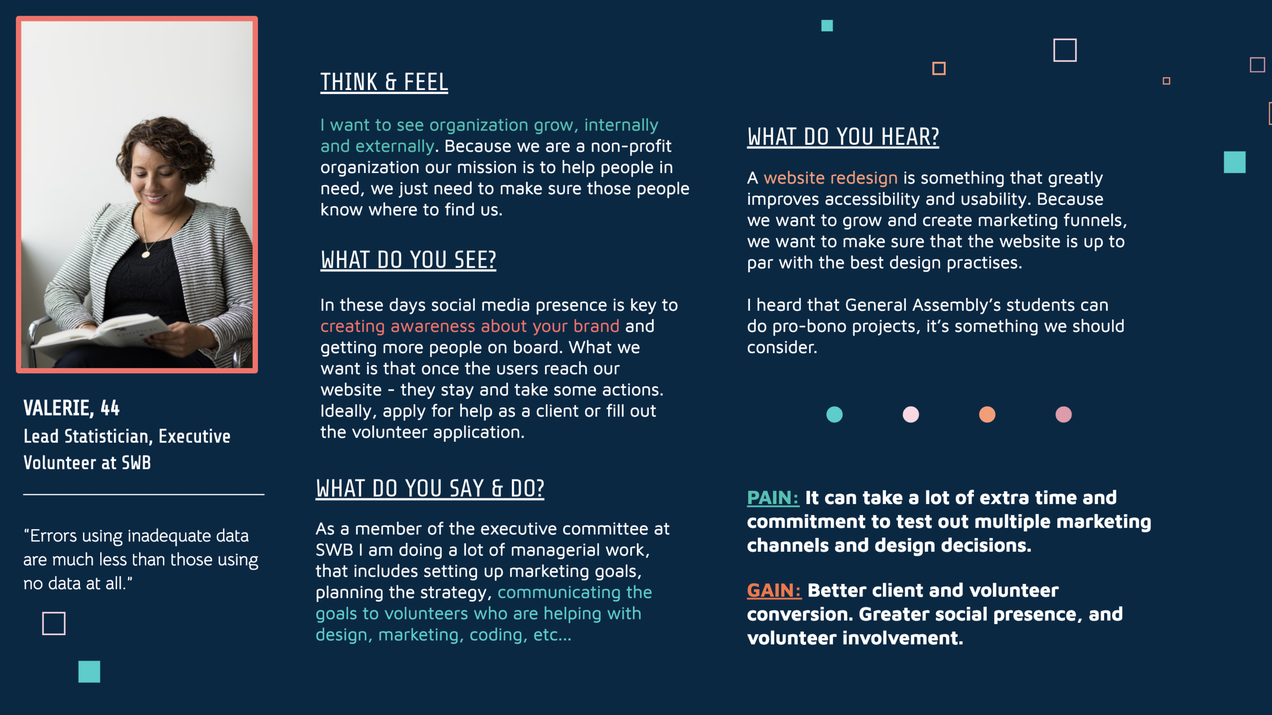
User Persona - SWB Stakeholder Perspective
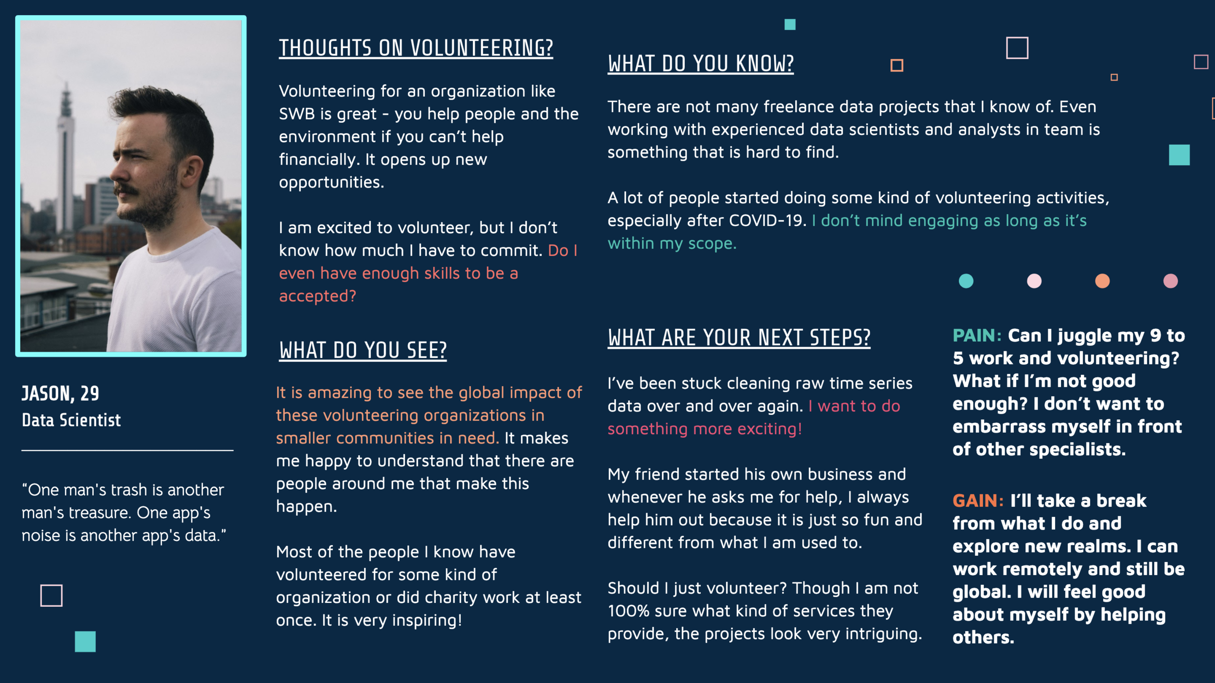
User Persona 2 - Potential Volunteer Perspective
Journey Mapping
Client Journey
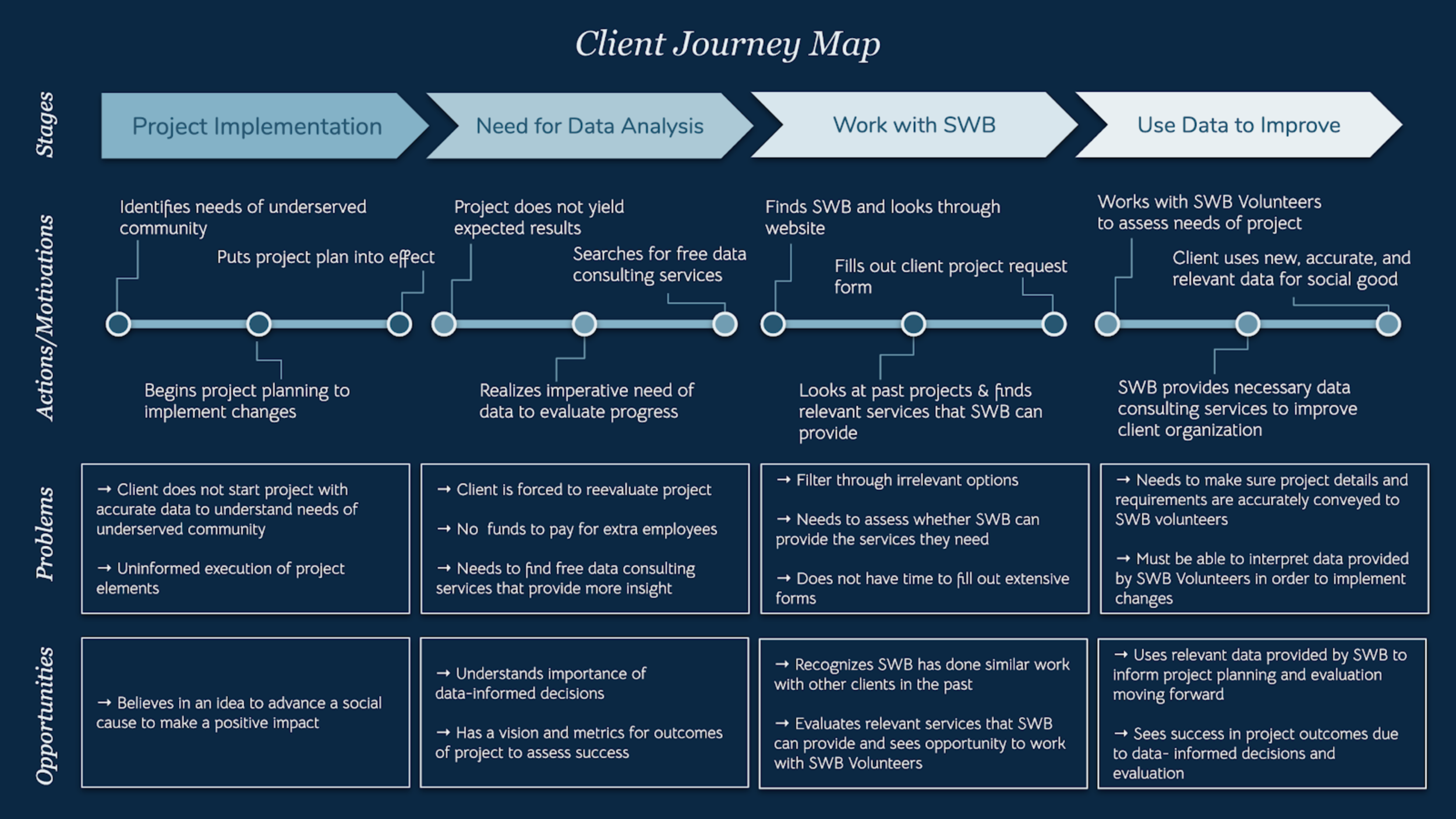
In addition to the insights from our user personas, we decided it was important to highlight the stages of a client journey.
I identified 4 stages in the client journey map to visualize how we could address the needs and opportunities as a potential client goes through these steps.
In the first stage, the client identifies a need in an underserved community and uses their idea to begin their project. They believe in a concept that can advance a social cause, however, the project isn’t based on informed data, so the client realizes the need for accurate data analysis to evaluate project outcomes in the next phase.
The client may need to reevaluate the project at this point, but they don’t have funds to hire data consultants, so they start searching for pro-bono organizations that can help.
In the next phase, they find SWB though their website and look through all the info/ past projects to understand whether or not they are the right fit.
They see all the services provided by SWB and realize they want to submit a project request, which takes them to the next phase where they can use the services provided by SWB to improve their project outcomes.
The user personas and journey map helped us set our design goals and determine the project scope to set objectives for our solution.
Main Goals for Redesign:
Effectively Convey Information → Highlight mission and provide easy access to relevant content
Reorganize Navigation → Improve information architecture to create a clear flow for clients vs. volunteers
Optimize Engagement → Make contacting SWB accessible for potential clients and volunteers
Efficient Visual Presentation → Modernize visuals and create appealing visual user interface (UI)
Card Sorting
Using Optimal Workshop, we started off with an open card sort using cards based off the content on the website. The findings helped us validate the current navigation on the website, which includes home, volunteer, projects, about us, contact us, but based on our user interviews and initial usability test findings, we realized a need to potentially add a separate section for clients. Also according to our competitive UI analysis, most data consulting websites provide a separate section to explain their services, so we decided to use a second closed card sort to validate our findings to ensure users find what they’re looking for based on target needs.
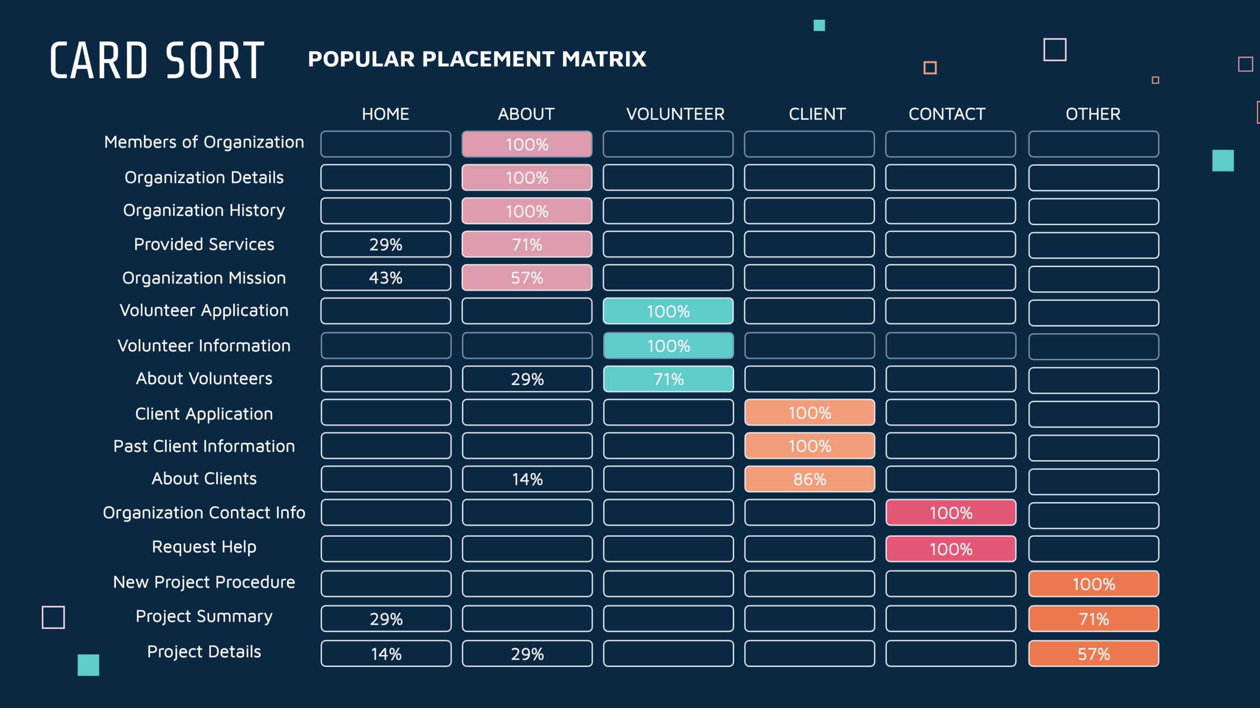
Popular Placement Matrix
For the closed sort, we set 6 categories: Home, About, Client, Volunteer, Contact, & Other.
We asked 7 participants to organize individual content cards into predetermined categories.
Most of the participants organized the content in similar categories as you can see highlighted in the various colors above. Overall these results validated the content we organized in the existing sections as well as the need to add a section for clients, while keeping a separate projects page.
Another takeaway from these results was our decision to modernize the navigation one step further by adding access to the homepage on the logo instead of an extra section, which also aligned with our competitive UI analysis.
Develop
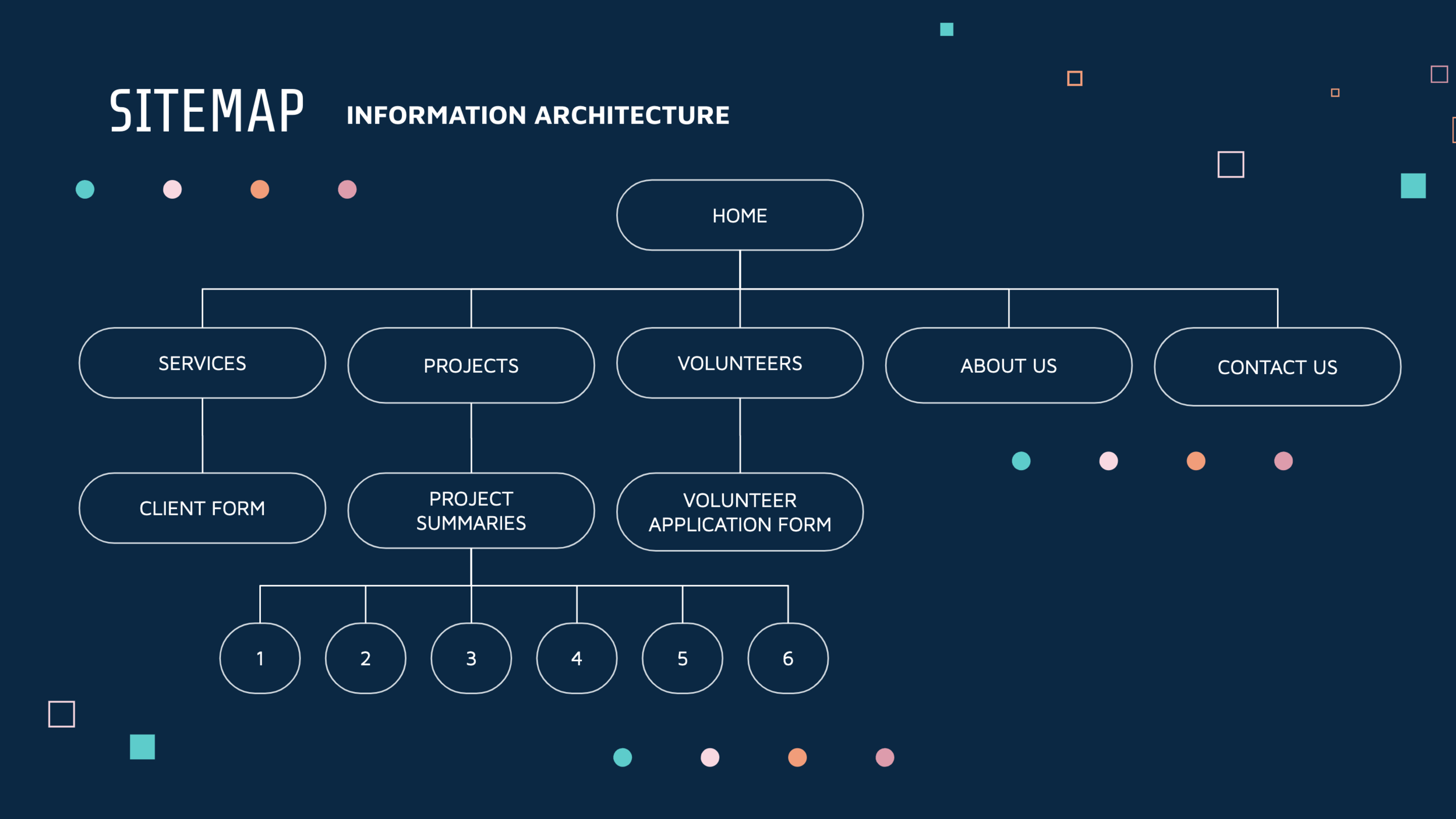
Based off the card sort findings, we finalized our sitemap and information architecture to create a clear flow for each type of target user, so whether you are a member, client, or volunteer, you can go through the site and find relevant information efficiently.
The results of the closed card sort helped our team determine the navigation of the new website to ensure users find information more intuitively.
Old Website → Mid-Fidelity Mockups → Final Prototype
Navigation
We decided to follow more modern conventions of UI design and place the navigation bar at the top of the page. We also made the navigation bar sticky for easy access as users scroll down each page. We added a “services” section to the bar, since our competitive research and user testing proved the need for an additional page.

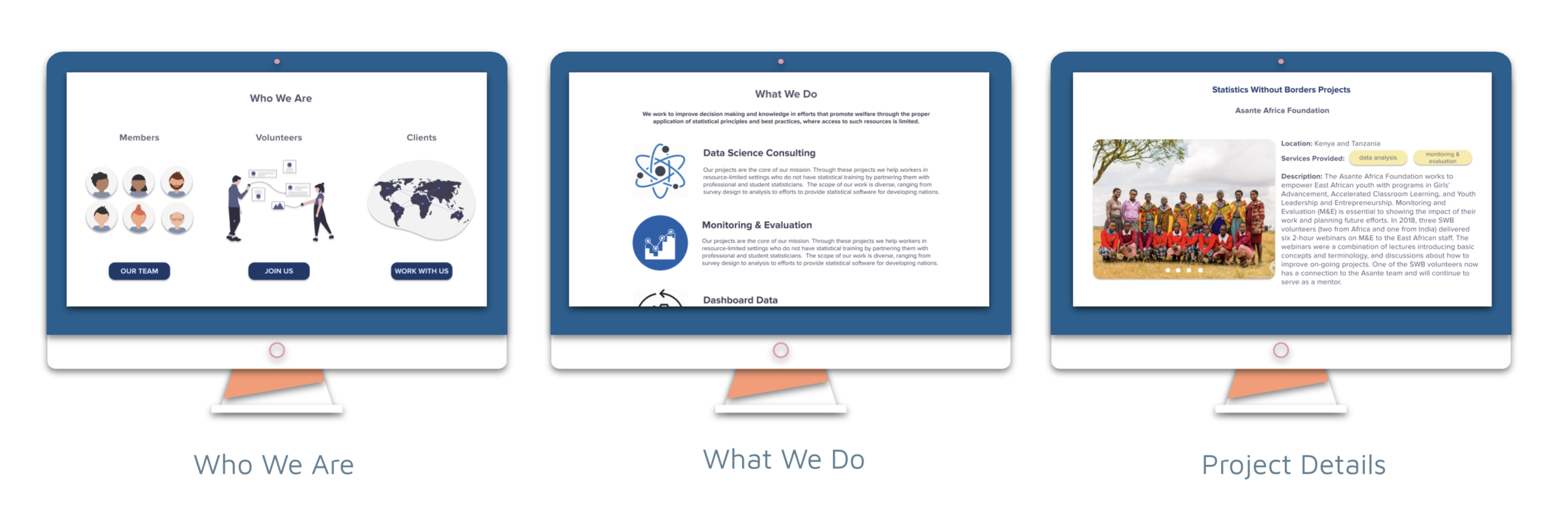
Homepage
We redesigned the homepage with more visual elements in order to make the content more digestible and organized for potential members, clients, and volunteers. We added distinct sections for SWB’s mission, “what we do”, “who we are”, projects, testimonials, a blog, and “contact us” form.
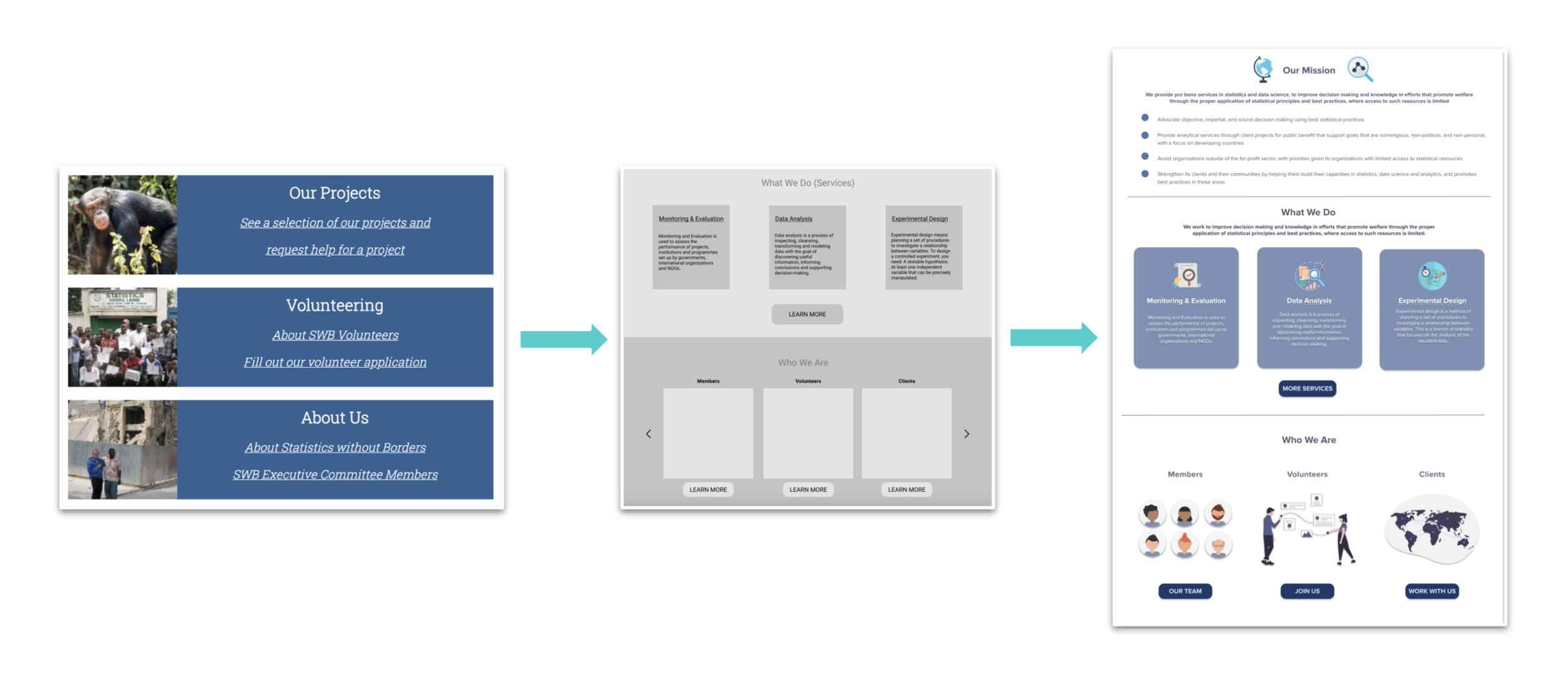
Major Additions to Homepage:
Along with redesigning the visual presentation of content on the homepage, we decided to feature the projects as thumbnails so users could access the case studies directly from the landing page.
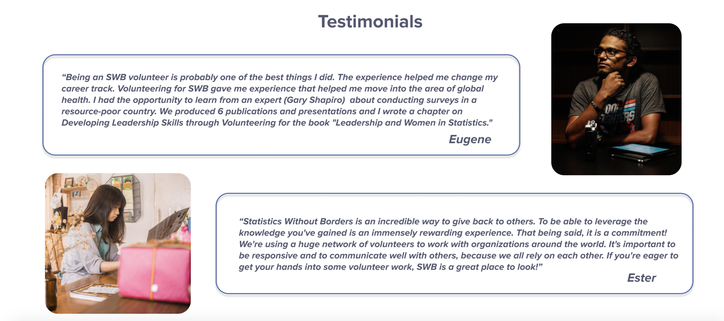
Based off our user interviews and surveys, we also decided to add testimonials to the homepage in order to offer more personal voices from the organization and build trust for potential clients and volunteers.
Homepage Projects Scroll
Homepage Testimonials
Blog & Contact
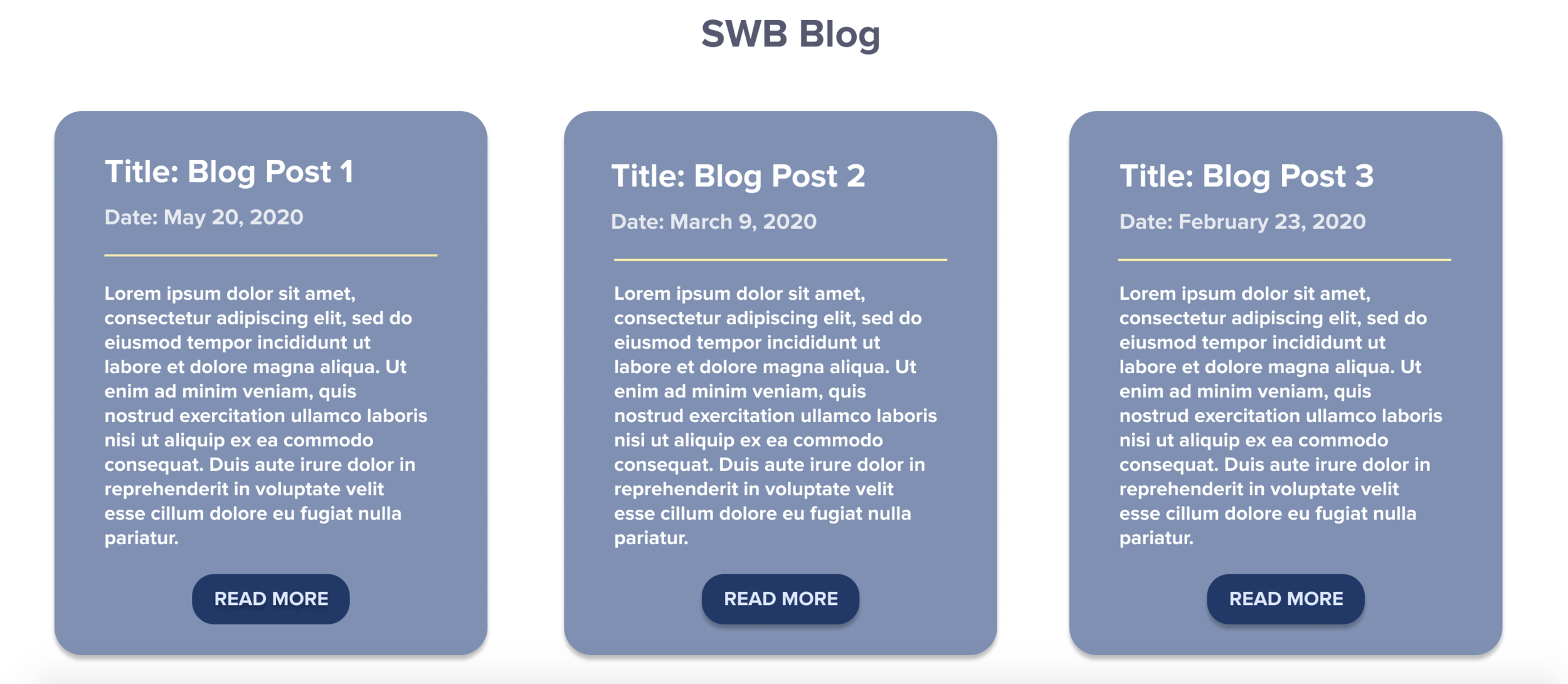
In our last stakeholder interview, a couple members brought up a last-minute idea to start a blog. Even though it’s in the initial stages, we wanted to provide a visual layout of what a blog section could look like on the homepage.

As users scroll down the homepage, they have access to get in touch with the organization right away as well as get more information about SWB’s volunteers and services.
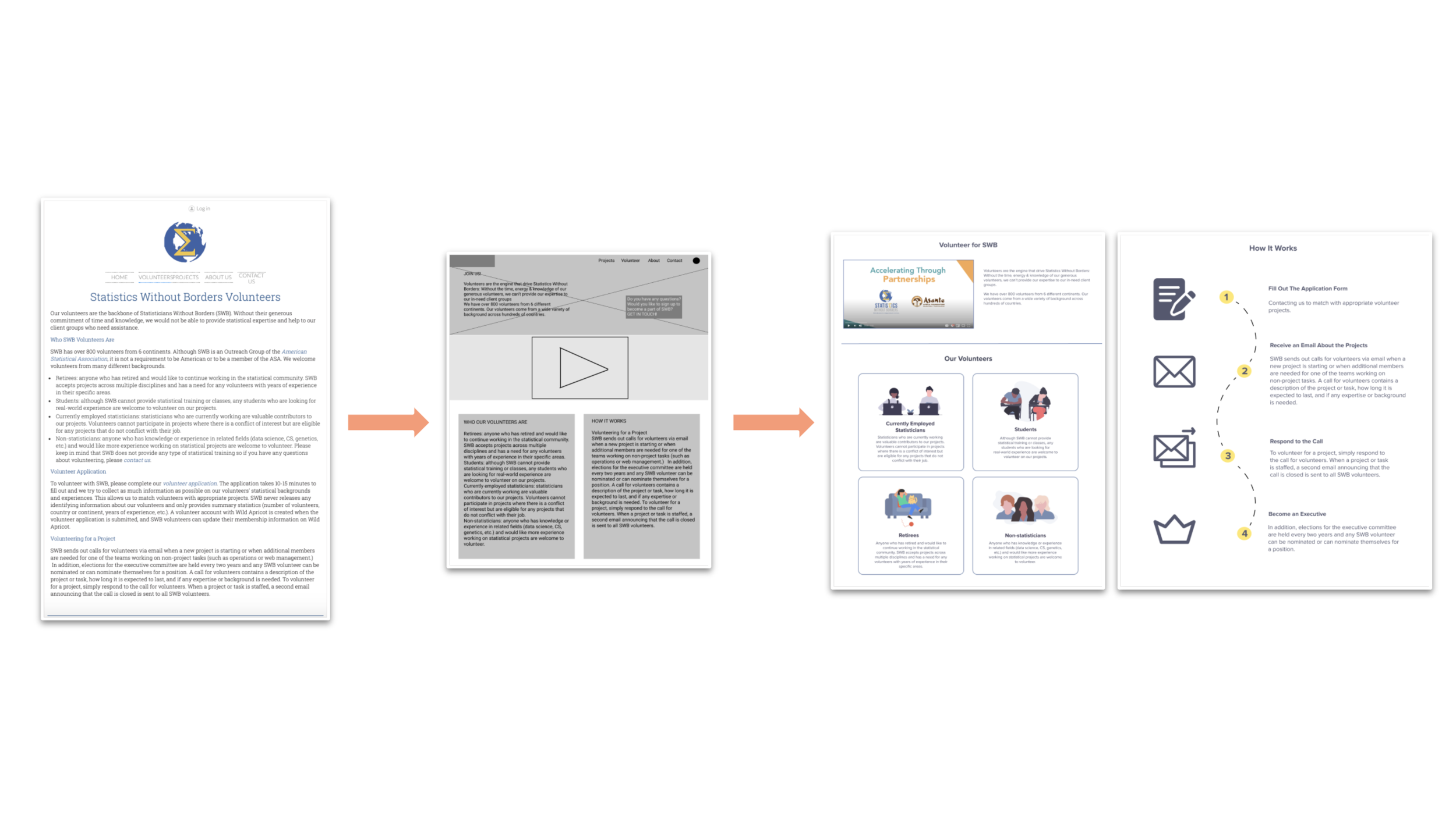
Volunteers Page
Potential volunteers can look through the new volunteers page to understand what kinds of skills volunteer require as well as the different types of backgrounds volunteers come from. Based on responses from our user interviews and surveys, we also wanted to highlight the process of volunteering in order to clarify what the process of working with SWB entails.
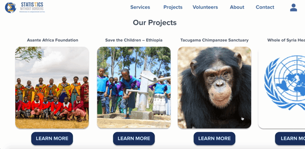
Project Sections
We reorganized the layout of the project summaries into a grid format in order to optimize space and make the section more visually appealing.
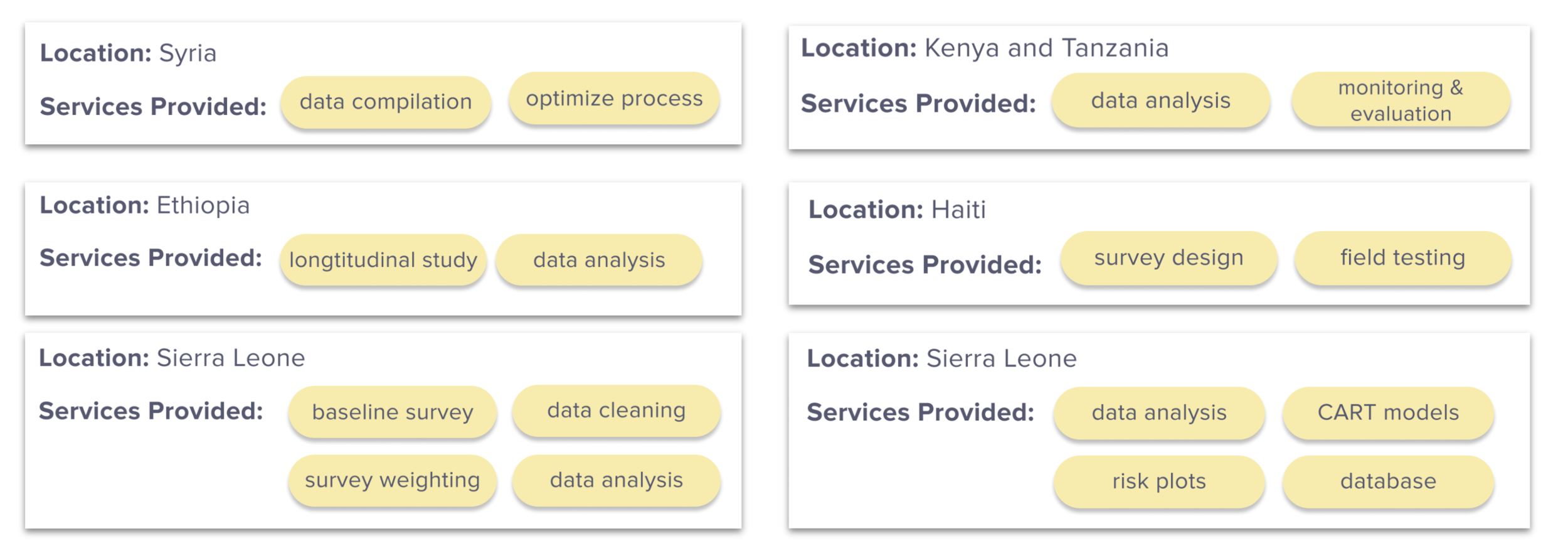
For the project details, we separated the content into location, services provided, and details in order to make the text more organized by relevant information.
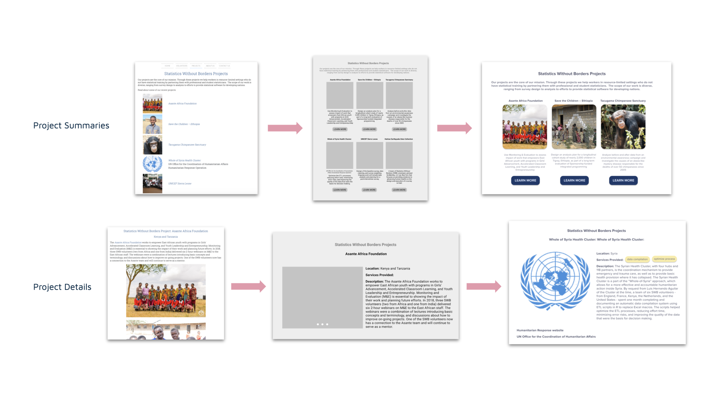
We wanted to make sure the project case studies allowed people to consume the relevant information more quickly and in a digestible manner, so we added tags of the major services provided by SWB within each description to make it easier for users to filter through the applicable projects.
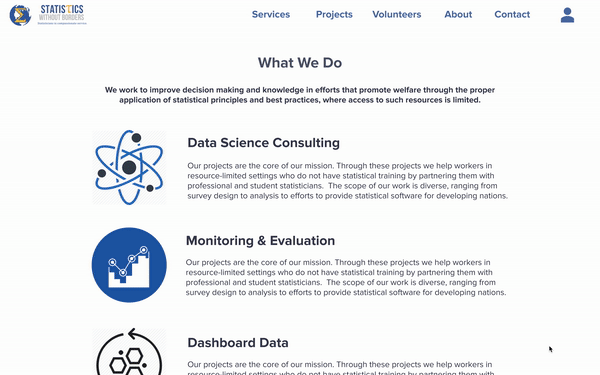
Services Page
The services page aims to provide clear access to the client intake form as well as a detailed description of all the kinds of services SWB provides to clients, as well as clear feature of what SWB can offer to potential clients and how they can benefit if they work with the organization.
Deliver
Usability Testing on High-Fidelity Prototype:
For our final round of usability tests, we provided 5 participants with tasks to test clarity of information, clicks/time taken to find relevant content, and intuitive UI elements.
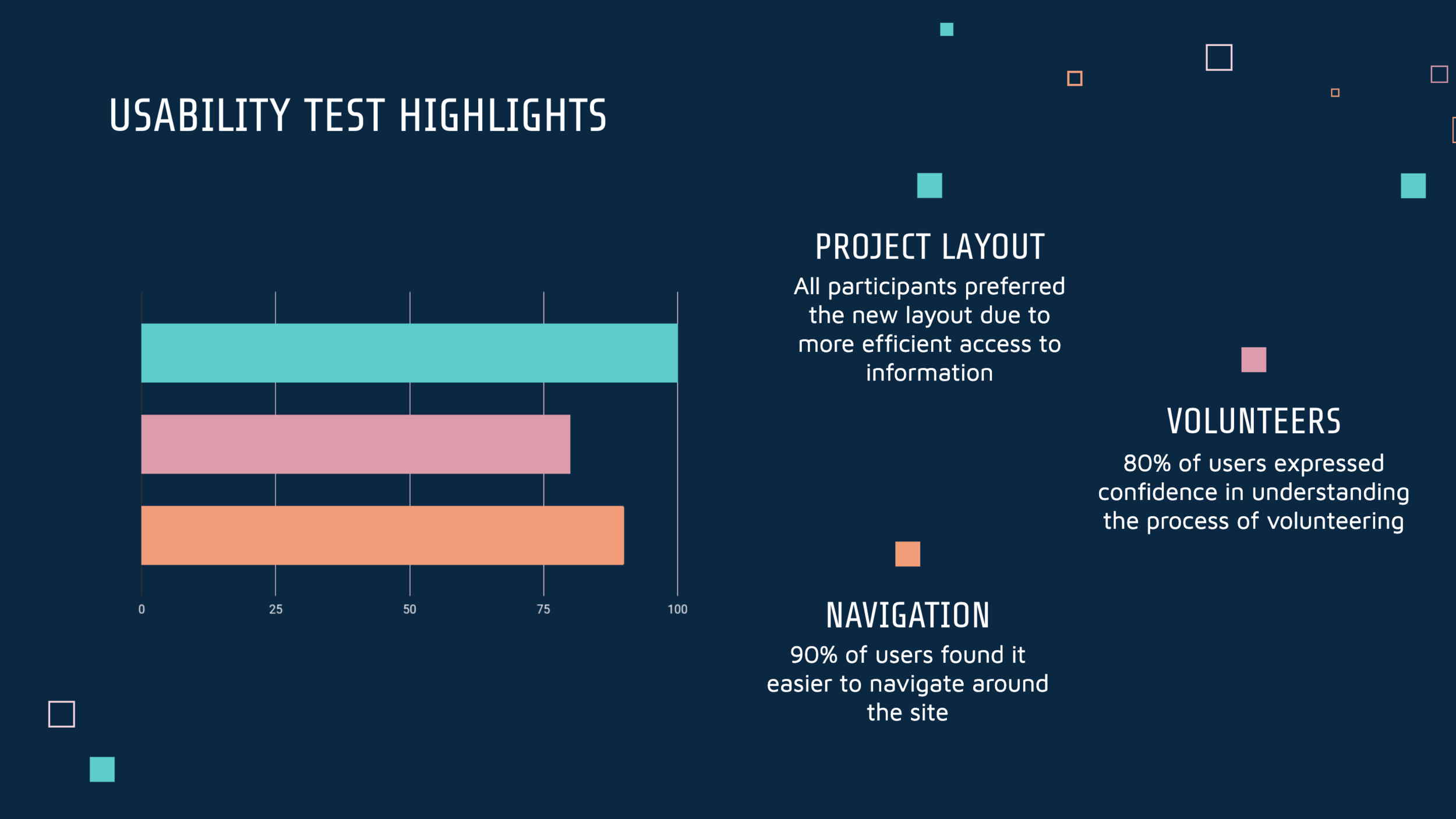
Key Findings:
Potential volunteers found relevant information much more quickly than initial usability tests
Potential clients were able to articulate specific services that SWB provides
Efficient “Contact Us” form encourages more engagement than the previous version
Main Iterations:
Added clickable links to photos & titles
Added more icons and photos to personalize sections and build trust
Refined content and wording to clarify interactions
High-Fidelity Prototype
Check out the final prototype here.
Next Steps
Further Testing → conduct additional usability testing, a/b evaluation, & validate accessibility for all types of users
Optimize Forms → a more comprehensive redesign of forms, including implementation with site management software
Blog/Newsletter → implement a native blog in order to provide members, clients and volunteers with recent updates and add a newsletter subscription for more ways to interact
Responsive Design → adapt the website to work on all screens, add a favicon, and ensure functionality for all user case scenarios
Bonus: Logo Options