OCTO: HubDC
Exploring UX methods to evaluate the usability and effectiveness of OCTO’s in-development tech hub in facilitating business growth in Washington D.C.
Introduction
With the lack of an all-encompassing resource for the DC tech community, the City of DC’s Office of the Chief Technology Officer (OCTO) intends to provide an innovative platform that allows entrepreneurs, businesses, investors, students, schools, and the general workforce to connect and encourage building a flourishing community.
For this project, I focused on assessing how effectively the beta version of the HubDC website worked as a platform to connect entrepreneurs with investors.
Objectives
Analyze HubDC’s competitive value and practicality as a one-stop-shop for the DC tech community
Assess the overall usability and usefulness of the product along with the inclusivity and accessibility of the site’s content
Evaluate the site’s relevance and helpfulness to connect startups with investors as a medium to facilitate growth for the DC startup community as a whole
Summarize findings and offer valuable recommendations to improve the product
Methodology
I started out this project to improve HubDC’s usability by performing a heuristics evaluation to assess the learnability, efficiency, memorability, error management, and satisfaction of the website. Through my observations, I identified user scenarios and tasks for usability tests that would provide further insight into the user experience.
In order to test the the site’s features that facilitate connecting entrepreneurs with investors, I utilized both informal and formal usability testing methods.
Heuristics Evaluation
Using the following scoring system, I recorded my initial observations to assess the heuristics of the site
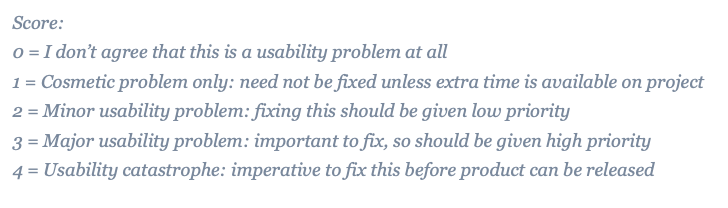
Learnability: 3
The main focus of the homepage is the search bar, so the site seems like a search engine at first glance
Tabs under the search bar indicate categories, which function as a secondary navigation menu → not conventional and creates confusion
Users have to scroll down to see the each section on the homepage and do not know exactly what to expect
Efficiency: 4
Navigation does not clarify where to click to browse categories vs. search categories
Layout of sections do not make the most relevant information easily accessible
Users have to scroll down past a “featured” carousel on the browse or search pages to see results
Users cannot filter their search easily or browse by specific industry
Memorability: 4
Logo, registration, navigation menu, and newsletter sign-up placed in conventional areas on site
Order of navigation menu is not conventional and the wording of sections is a bit vague
Second navigation menu is below the search bar, which feels scattered and not conventional
Inconsistent navigation menus across the pages
“Add a profile” button is easy to miss due to placement on category pages
Error Management: 4
If a user searches for something, there is no option to change the category of the search on the results page
Inconsistent navigation makes users click through multiple links before they can get to where they want
Satisfaction: 2
Visually professional site that cleanly conveys information
Hover effects on links add nice detail
Product does not necessarily jump out as a tech-related website
Generic/bland profile pages, which don’t convey personality
Comparative & Competitive Analyses
Analyzing the current market and comparing competing features with HubDC

HubDC • Analysis of Strengths, Weaknesses, Opportunities, and Threats
Feature Analysis
HubDC offers competitive features for users to compile business resources, except for the ability to raise capital directly on the website
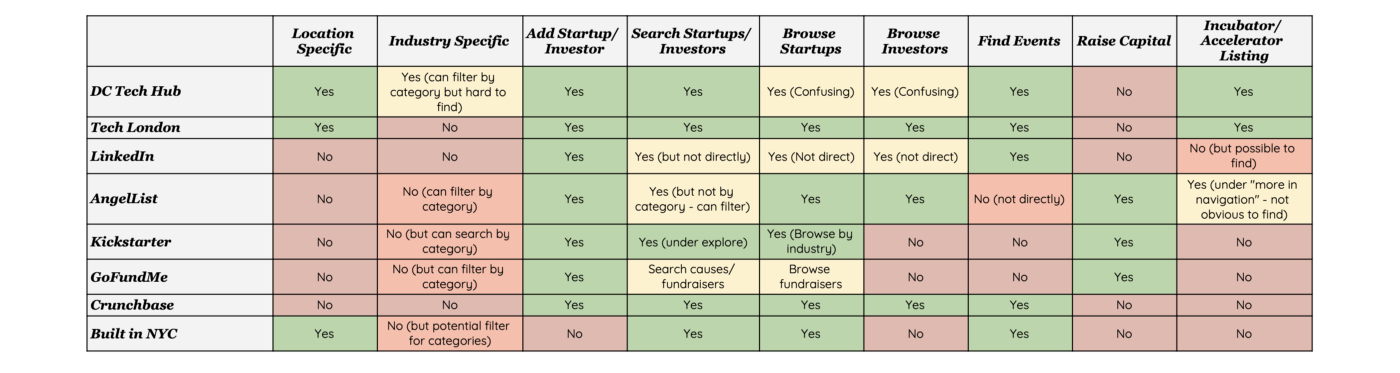
Comparison of Features on Competitor Platforms
Search + Map Feature Comparison
HubDC does not have a “use current location” option, but users can filter the search by category, however the option is hardly distinguishable
Users can search by location, but cannot filter by location

Informal Usability Tests
I recruited five participants (age 18+) from my network in the DC metropolitan area to conduct informal usability tests. Due to COVID-19 social-distancing measures, I carried out these tests remotely using Zoom. I asked the participants to share their screens and to talk through their thought processes.
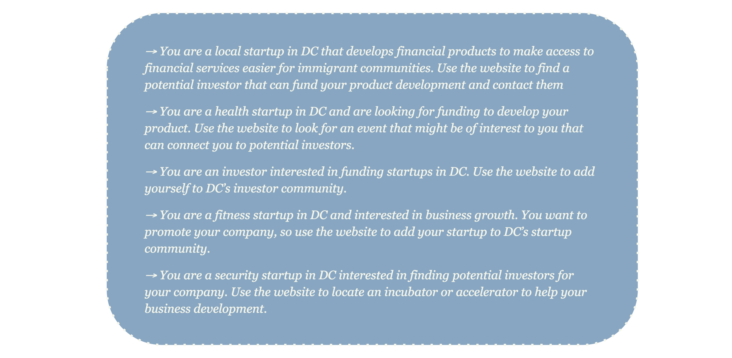
Tasks for Informal Tests
Summary of Findings
All users agreed the website consolidated important resources for startup growth in DC
All users experienced some sort of confusion around the navigation bar and how to get from one page to another
Users who spoke English as their second language expressed confusion around the wording of the navigation bar, especially not realizing where to click to browse sections
3/5 were able to find the “add your profile” button under the featured section and 1/5 users located the option to “create company/investor” on the bottom of the page, but all 4 expressed that the task took a while → 1 user was not able to locate the button and gave up
Users did not immediately scroll down (past the “featured” carousel) to see the display of search results or browse section — all users lingered and hesitated before scrolling down
0/5 used the filter by category dropdown feature to search or browse by industry
Creating Proto-Personas
Using my initial research around usability with the informal tests, I synthesized similarities and trends among users to create three user proto-personas that encompass the major archetype of users for HubDC.

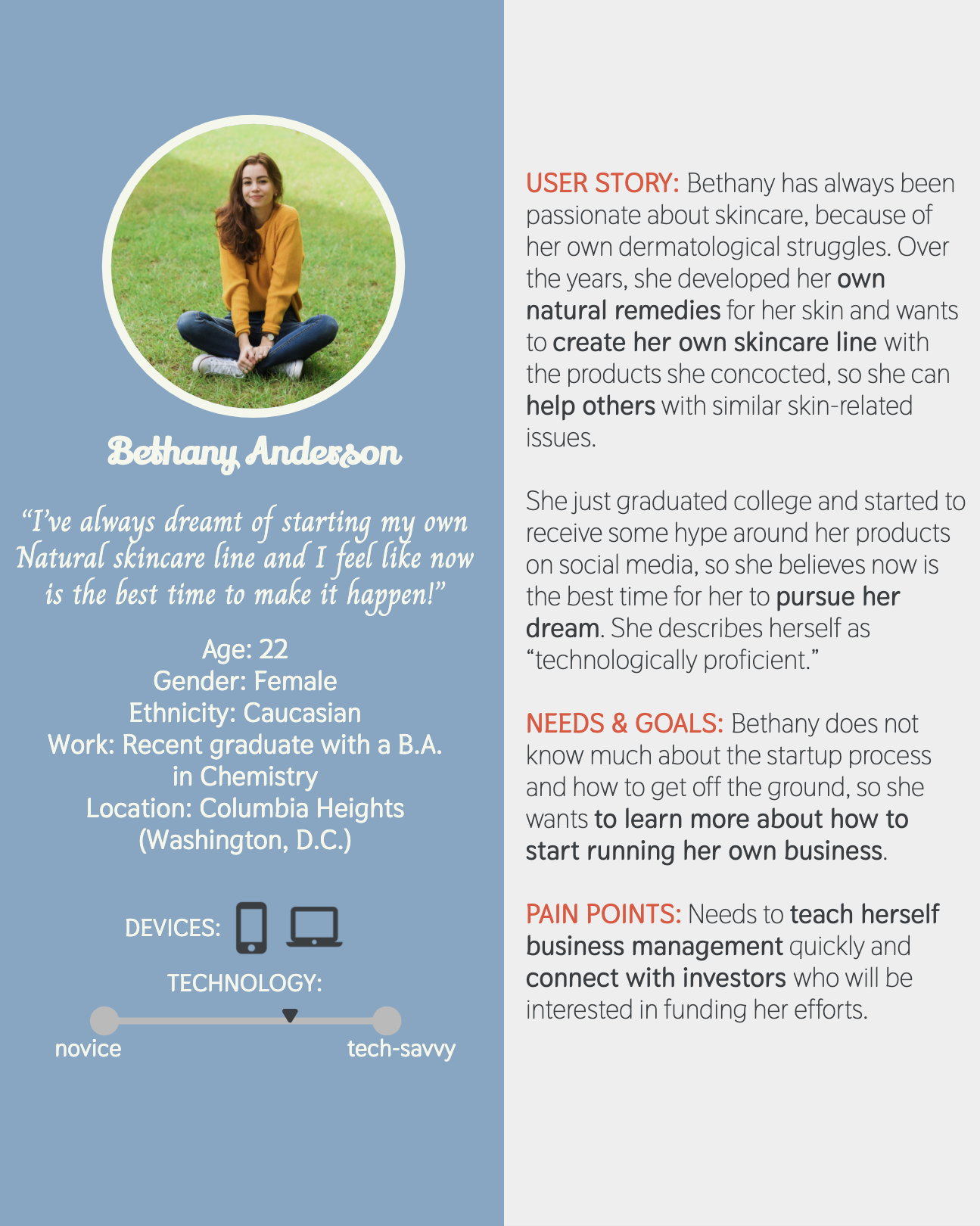
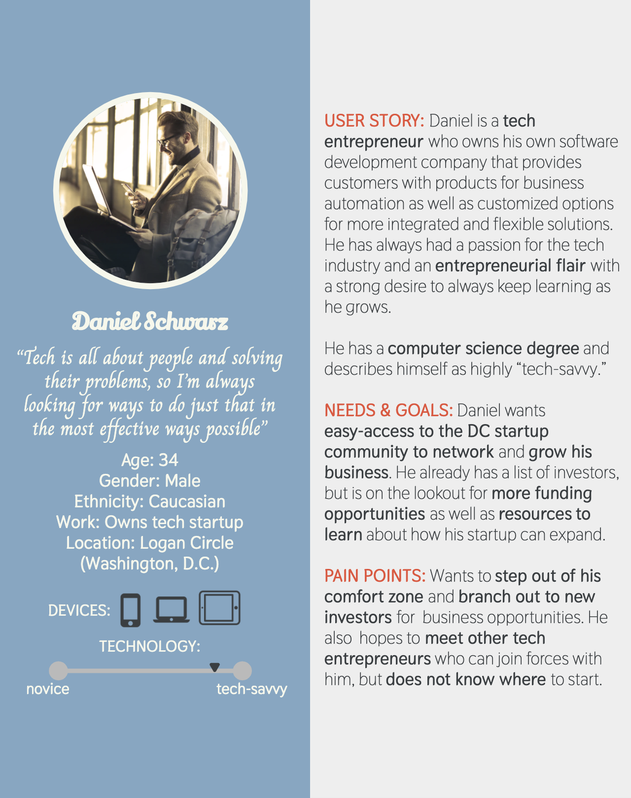
Out of the three personas, Mariana Hernandez — a stay-at-home mom who wants to balance her personal responsibilities along with starting her own bakery business — stood out as a representative user for HubDC, since the site would have to effectively address her varied needs in order to provide a comprehensive resource for diverse entrepreneurs and startups.
Based on Mariana, I catered the tasks for the formal usability tests to assess the functionality and clarity of the navigation, search, and map features. Since Mariana’s first language is not English, I needed to evaluate the site’s use of language for ESL users. She works under time constraints in order to balance her responsibilities, so I needed to make sure the site provides her with accessible, relevant, and readily available information during her search. She also wants to stay near her neighborhood in the DC metropolitan area, so I made sure to test the usefulness of the map feature.
Formal Usability Tests
I used UserTesting.com to conduct three formal tests (written in English) with their User Testing Panel, which includes participants (age 18–65+) using computers.
Scenario:
“You are a stay-at-home mother/father who has a lot of responsibilities to fulfill for your family, while also starting your own career in the restaurant business. You are in the process of starting a bakery and you need to find ways to balance your personal responsibilities with your startup efficiently. You can’t leave your house for too long and you don’t want to drive too far and prefer the work you put into your startup to be accessible and quick.”
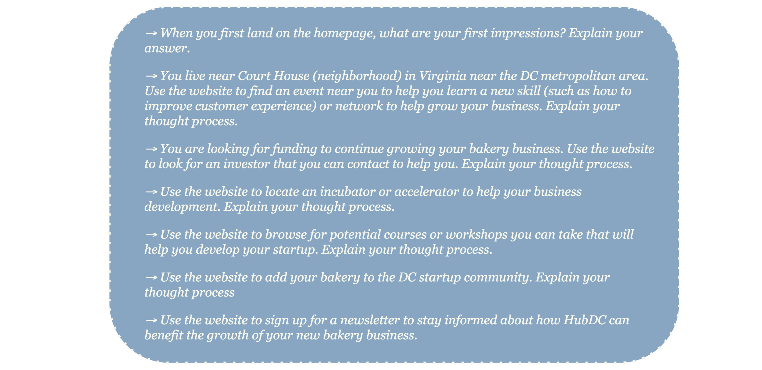
Tasks for Formal Tests
Summary of Findings
All users experienced delays due to disorganized navigation menu and each user expressed their frustration about not knowing where to look for a specific section or what to expect when they click on something
The layout of some pages made certain features difficult to locate
All users felt they could not access relevant information as quickly as they should
Users had to guess as they navigated through certain tasks, because they were not sure about what to expect when they clicked on something
2/3 forgot at least once where they clicked previously to find a specific page
0/3 used the filter by category dropdown feature to search or browse by industry
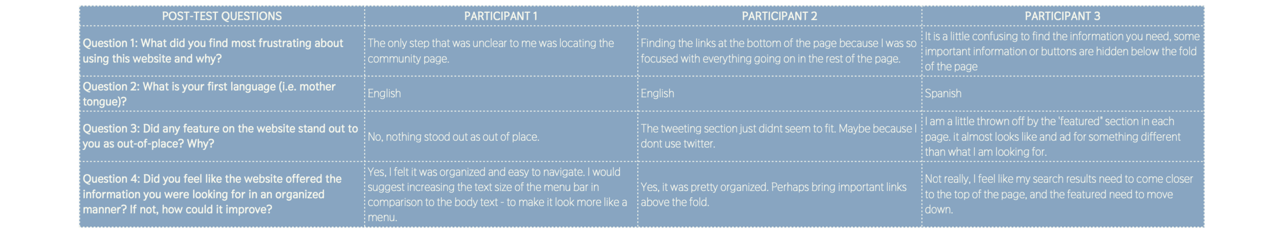
Participant Answers to Post-Test Questionnaire
Key Insights
The main usability and accessibility issues I uncovered through informal and formal tests centered around clarity of language, limitations of the search feature, and unorganized information.
Language & Word Choice
→ Users experienced confusion around scattered and vague navigation, especially users whose first language was not English
→ All users who spoke English as a second language expressed lack of clarity around “Discover” section in navigation
Search Feature
→ Users intuitively felt the need to filter their search by location or industry keywords, but struggled to do so because they could not locate what options they had to narrow down their information or search
Layout of Information
→ Users noted the “featured” section as a distraction from finding relevant information on the browse and search pages
→ Users took a long time to locate the “add a profile” or “create a profile” button and expressed that the location of the button did not feel intuitive
Recommendations
Based on key insights from my usability tests and research, I suggest HubDC consider the following options to improve the effectiveness of the platform as a resource to facilitate growth in DC’s diverse tech community:
Improve Language & Word Choice
→ Change language (terms) on website to make terms easier to understand and add explanations to sections that may require additional information to improve clarity and provide users with an idea of what to expect before they even land on a page
→ Consider changing “Discover” to “Discover Community” in navigation menu
Simplify Navigation & Maintain Consistency
→ Make navigation more clear and seamless by adding the categories (currently under the search bar) to main navigation bar on homepage and keep it consistent throughout the flow of the site, so users have easy access and they know/remember where to click
→ Consider adding hover menu for categories under “Discover”
Advanced Search + Map Features
→ Allow users to browse or search categories with multiple filters (i.e. by industry, location, date, etc.) and place the filters in an obvious/intuitive location near search bar
→ Ensure that profiles tag their location and connect those tags to “searchable keywords” in the search feature and on the map
Enhance Layout & Content
→ Change layout of the browse/search results pages to provide users with relevant information more rapidly by bringing the browse/search results above the fold, so users do not have to scroll to see information they might miss otherwise
→ Change placement of the “featured” section on category pages to provide users with information they expect to see before they see the “featured” carousel
→ Celebrate and promote diversity by creating a community space to facilitate networking and connections
→ Add a call-to-action for new startups on the homepage to show entrepreneurs and business professionals what HubDC can offer them right away
Conclusion
Overall, HubDC offers great potential to provide a comprehensive resource to help startups facilitate business growth. With the right improvements in usability and accessibility within the product, OCTO can create a platform to improve the process of connecting diverse entrepreneurs to a network of investors and help the DC startup community thrive.